Monday, December 31, 2012

Samsung Galaxy Note II Review advantages and disadvantages

0 comments

The Samsung Galaxy Note II comes with a Super AMOLED touch screen size measures 5.5 inches with a resolution of 1280 x 720 pixels, and is powered by four Quad Exynos chipset with a 1.6GHz quad-core processor and 2GB of RAM.

Samsung Galaxy Note II is equipped with 8 megapixel camera and 1.9 megapixel front behind, and has a battery with a capacity of 3100mAh. Samsung Galaxy Note II is thinner than its predecessor, with only 9.4mm thick and weighs 180 grams.

Samsung Galaxy Note II is also equipped with S-Pen that comes with new features. Some of the latest features including Air View, which allows users to preview email content, S-Planner, Image Gallery, or video without the need to open the application. There is also a Quick Command, which allows users to open applications that are opened quickly.


Samsung Galaxy Note II is available in three internal memory options of 16GB, 32GB, and 64GB plus a microSD slot support up to 32GB. This device will be available in Europe and the United States in October 2012, and following other region thereafter.


Samsung Galaxy Note II Main Features and Advantages

Quad-band GSM and quad-band 3G with 21 Mbps HSDPA and 5.76 Mbps HSUPA support
Optional LTE connectivity
5.5" 16M-color Super AMOLED capacitive touchscreen of HD (720 x 1280 pixel) resolution; Corning Gorilla Glass 2
Android OS v4.1 with TouchWiz launcher
1.6 GHz quad-core Cortex-A9 CPU, Mali-400MP GPU, 2GB of RAM, Exynos 4412 Quad chipset
S Pen active stylus with deep system integration
8 MP wide-angle lens autofocus camera with LED flash, face, smile and blink detection
1080p HD video recording at 30fps
16/32/64GB internal storage, microSD slot
Dual-band Wi-Fi 802.11 a/b/g/n support
GPS with A-GPS connectivity; GLONASS support, Digital compass
NFC support
Stereo Bluetooth v4.0
FM radio with RDS
microUSB port with USB host and TV-out (1080p) support, MHL, charging
Accelerometer, gyroscope and proximity sensor
Standard 3.5 mm audio jack
Great audio quality
Very slim at only 9.4mm
1.9MP secondary video-call camera
Document editor and file manager comes preinstalled
Extremely rich video and audio codec support
Huge 3100 mAh battery


Samsung Galaxy Note II Main disadvantages

Large size makes single-hand operation problematic
No dedicated camera key
All plastic construction (would have probably weighed a ton otherwise, though)
S Pen not as good as on the Note 10.1


Read more ►

Wednesday, December 5, 2012

Sony Xperia E Release date and specs

1 comments
Sony Xperia E is an affordable and compact for today's standards featuring Sony's recognizable design language. The stand-out feature Sony wants us to note in the Xperia E is HD Voice, the purpose of which is to noticeably boost the sound quality of phone calls. When it comes to specs, the Xperia E will deliver a mid-range experience with its 3.5" HVGA touchscreen and 1GHz processor. Let's hope that Jelly Bean's Project Butter will help get rid of the lag. Sony also claims that we'll be surprised by the battery life of the device. The 1500 mAh battery will benefit from a special extended stand-by mode designed to increase overall battery life. Basically, when the phone's sleeping, it will disable all functions except for calling and messaging, and once you wake it up, all functions will be restored to their normal state. Of course, users will be able to enjoy Sony's "Walkman" music experience, as well as the xLOUD sound technology, which works really well in most Sony smartphones.


Sony has unveiled a new budget handset in the Xperia E, which will ship with Android 4.0 Ice Cream Sandwich.

The smartphone, scheduled for a release during Q1 2013, sports a 3.5-inch HVGA 480x320 pixel resolution LCD, which should deliver a pixel density of about 165 pixels-per-inch.

Powering the device is a 1GHz Qualcomm Snapdragon S1 MSM7227A single-core processor, alongside 512MB of RAM and an Adreno 200 graphics processing unit.

As well as the the re-branded TimeScape UI, now known as the Sony UI, and 4GB of internal storage space with a MicroSD expansion slot, the Xperia E features a rear-facing 3.2-megapixel camera.

Sony has particularly singled out the device's xLOUD audio technology and 3D surround sound support, accompanied by HD voice and noise cancellation.

A 1,530mAh battery pack delivers up to 530 hours on standby or six hours of talk-time, Sony said. The smartphone itself will be available in black, white and pink.

If we find out more about an exact release date or pricing we will let you know. Would you buy the Xperia E or E dual for about $200 without a contract ?

Release date: Q1 2013
Source
Read more ►

Galaxy Note™ II Smart Dock Avilable

1 comments

Overview

The Samsung Galaxy Smart Dock makes it easy to take advantage your phone’s high-speed internet connectivity and super-fast processor. Connect an HD monitor, external storage device, and USB keyboard and mouse to turn your smartphone into a productivity powerhouse. Make messaging, editing documents and accessing media files a breeze. Plug in your 3.5mm stereo audio components or speakers and you have the ultimate pocket-sized home theater and computer in one.


 With its 5.5-inch screen, the Galaxy Note II terminal is already the most productivity-oriented product, but Samsung goes further by revealing the "Smart Dock" docking station.


While Motorola has recently announced the abandonment of the solution Webtop inaugurated on the Atrix, Samsung takes more or less the same estate.

The "Galaxy Note II Smart Dock" is actually similar to the "HD Multimedia Dock". It allows to connect the monitor, keyboard, mouse and other peripherals to the smartphone. The Android is displayed in full and it is not a Linux environment. It's less embarrassing than the time of the Atrix, since Android 4.1 Jelly Bean adapts well to high definition.

features

3.5mm Stereo Out
Stream stereo sound to your speakers or stereo components.
HDMI™ Out
Work, play or view media on large monitors and HD TVs Standard USB Out (X3) Connect compatible keyboards, mice, external storage and other input devices.
Versatility
Functions whether or not a Flip Cover and most slim case options are installed.
Fully Functional
Your phone is fully functional while charging in the Smart Dock. Watch your handset stream news, local weather, or just play with your apps…all while charging!


Source
Read more ►

Tuesday, December 4, 2012

LG Optimus 4X HD review

0 comments

LG’s Optimus 4X HD is the company’s new flagship handset, and it’s certainly not messing around with the specifications. There’s a 4.7in 1,280x720 IPS screen, an Nvidia Tegra 3 chipset with a 1.5GHz quad-core processor and an eight-megapixel camera with a backlit sensor. This puts it up against top-of-the-range phones – such as the HTC One X and award-winning Samsung Galaxy S3.

The 4X HD doesn’t look as fancy as the One X and S3; instead of a curved screen and rounded pebble shape you get a more standard rounded rectangle. It’s easy to maintain a solid hold on the phone thanks to a textured back, and two parallel chromed plastic ridges around the edge provide grip for your thumb and fingers. The outside of the phone is sparse, with just a power button, volume rocker, headphone jack and Micro USB port; you don’t get a dedicated camera button, and have to pop the back cover off to get at the microSD card slot.
The 4.7in screen takes up most of the front of the phone, and it’s an impressive display. There’s no AMOLED display, as on the Galaxy S3, but it is a superior IPS-type LCD. There’s slightly less contrast than on the Galaxy S3, but the operating system, photos and videos still look great; the screen is definitely a match for the IPS model on the HTC One X. The 1,280x720 resolution is the same as that of the One X and Galaxy S3, and gives a pixel density of 313 pixels-per-inch – comparable to the 312 of the One X and 306 of the Galaxy S3. You can’t see the pixels, at any rate, and we can’t imagine anyone having any complaints about the display.
LG has heavily customised the handset’s Android 4.0 operating system. Many of the icons are LG’s own, and they’re big, bright and colourful, and work well with the large, high-resolution screen. Like stock Android 4.0, the main app screen is divided into Apps and Widgets, but the 4X HD also gives you a separate section for the apps you have downloaded.

There are some useful preinstalled apps. LG’s own video player has a preview which lets you scan through videos with a picture-in-picture box without leaving your current place. You can also pinch-to-zoom and pan around while a video is playing. The SmartShare DLNA app lets you play back media files stored on DLNA servers, and also control playback on other DLNA devices from the phone. The only app we didn’t get on with was LG’s own email app; it wouldn’t let us connect to our company Exchange server due to a problem with SSL certificates – most Android email apps have the option to accept all SSL certificates, so getting around our Exchange server’s quirks, but this is absent from LG’s app.


Source
Read more ►

Sunday, December 2, 2012

Showing Prototype from Sony C650X with Widescreen Revolution

0 comments
Sony middle borrows by completing a major project they to create 2 units of a Smartphone with a large screen, it is Semartphone Both Sony C660X and Sony C650X. The following is the appearance on the Internet in an appearance prediction from Sony C650X

In the picture above is quite clear screen that appears quite wide and has a very thin bezel. But the pity is that in the picture on the phone does not turn on the position. So, we cannot predict what applications appear on the home screen.

Rumors were circulating already become hots news at all gadget lovers. Mobile is going to proclaim the article in the competition for the Galaxy Note II or Optimus Vu. Most likely Sony C650X Odin comes with a 5-inch screen. And will be supported memory access speed quad core 1.5GHz processor from Qualcomm.

Officially, the Sony has not testified at all, but most likely also widescreen Smartphone will be showing at CES 201


Source
Read more ►

Friday, November 30, 2012

Nexus 4 wireless charging

1 comments

One of the more notable features that happened to find its way inside the Google Nexus 4 was its wireless charging capabilities. Compatible with the Wireless Power Consortium’s (WPC) Qi standard, this allows for the Nexus 4 to charge wirelessly with compatible docks right out of the box. No need for special battery covers, or ugly cases — it’s all built right in.

When Google first announced the Nexus 4, they talked briefly about a wireless charging dock for the device that they would, at some point, sell directly from the Google Play Store. We haven’t heard anything since, but if you’re looking to get in on some wireless charging of your very own, there’s no need to wait around for Google to appease you. There are plenty of Qi enabled wireless charging stations available right now from manufacturers like LG and Energizer.

While LG’s charging pad  seemed to work fine in the short 3 minutes of the video, I did find that it was a bit finicky and would disconnect/reconnect after a few minutes time. This resulted in a loud beeping noise coming from the pad letting you know it was connected, but for light sleepers out there, it may prove troublesome.


Energizer also has their wireless charging pads (you can find ‘em at retail stores like Target or Walmart), and reviews seem to be mixed when it comes to Nexus 4 users. The glass backing on the Nexus 4 causes the device to slip around and because Energizer’s pads are on a slight incline, they could cause the phone to completely slide off the pad altogether. You can see where a bumper case would come in handy for added grip (or a can of Plasti-Dip). Energizer’s pad did fare better in the rest of the review, keeping the device charging constantly, and requiring little-to-no fuss in regards to placement.

While the convenience of wireless charging is still under some review (holding your device while it’s charging is pretty much out of the question), there is a definite effort to bring wireless charging into the mainstream. The only problem, like most things, is there’s 2 main camps fighting to become that standard: Duracell/Powermat’s Power Matters Alliance, backed by AT&T, Starbucks, at Google — and the Wireless Power Consortium. Who will come out on top is anyone’s guess.


Source

Read more ►

Wednesday, November 28, 2012

LG Optimus G2 with dual Qore CPU and Android 5.0

0 comments
LG Optimus G has just landed to some countries. However, rumors about the successor of the mobile phone was already emerging. A successor is said to have the name of LG Optimus G2. This phone is rumored to have a more advanced specification than the Optimus G.


Mobile is said to be present with Krait-based quad-core processor with a speed of 2GHz or 2.5GHz. In addition, the phone will also be equipped with Adreno 320 GPU, and at least 2 GB of RAM.

Still not enough, LG is also rumored to be pinned full HD 1080p screen on the mobile phone. Moreover, the company is currently based in South Korea is indeed developing a full-screen HD. So it is not surprising that they would use the Optimus G2.

Regarding the operating system, is expected this phone is already using Android OS 5.0 Key Lime Pie. As for the camera, there is a 13 MP camera on the back.


Source
Read more ►

Monday, November 19, 2012

Sony Xperia GX Specs & review

1 comments
The Sony Xperia GX is an Android 4.0-based LTE handset with a 13-megapixel camera and is made for release in Japan. It features a 4.6-inch, 720p "Reality Display" utilizing Sony's Mobile Bravia Engine, a dual-core 1.5GHz processor, and 16GB of internal storage.


Besides Xperia Ion targeted for the Japanese market, Sony has introduced two mobile phones, one of which adopt 4G LTE technology in Japan. The phone in question is the Xperia GX. This device runs on the Android 4.0 operating system or the more famous by the name of Ice Cream Sandwich.

And as mentioned about the camera, the Xperia GX offers high resolution 13 MP camera with HD video recording capabilities and LED flash.

Sony Xperia GX

The GX has a display size of 4.6 inch Mobile BRAVIA and dual-core processor 1.5 GHz. For internal storage, 16 GB of space served.

With LTE technology, Sony claims this divice is capable of downloading up to 75Mbps.

Unfortunately, this Smartphone just released in Japan. Sony has not announced pricing, and plans to sell the Xperia GX in other countries.


 Sony Xperia GX full specification look this table :
Overview 2G Network GSM 850 / 900 / 1800 / 1900
3G Network  HSDPA
4G Network LTE 2100
SIM Micro-SIM
Announced 2012, May
Status Available. Released 2012, August
Design Dimensions 131 x 69 x 8.6 mm (5.16 x 2.72 x 0.34 in)
Weight 127 g (4.48 oz)
  - Touch-sensitive controls
Display Type LED-backlit LCD, capacitive touchscreen, 16M colors
Size 720 x 1280 pixels, 4.6 inches (~319 ppi pixel density)
Multitouch Yes, up to 10 fingers
Protection Scratch-resistant glass
- Sony Mobile BRAVIA Engine
- Timescape UI
Ringtones Alert types Vibration; MP3 ringtones
Loudspeaker Yes3.5mm jack Yes
Storage Card slot microSD, up to 32 GB
Internal 16 GB storage, 1GB RAM
Connectivity GPRS Up to 86 kbps
EDGE Up to 237 kbps
Speed HSDPA, 14.4 Mbps; HSUPA, 5.76 Mbps; LTE, 25 Mbps UL, 75 Mbps DL
WLAN Wi-Fi 802.11 a/b/g/n, Wi-Fi Direct, DLNA, Wi-Fi hotspot
Bluetooth Yes, v3.1 with A2DP
USB Yes, microUSB (MHL) v2.0
Camera Primary 13 MP, autofocus, LED flash
Features Geo-tagging, touch focus, face and smile detection, 3D sweep panorama, image stabilization
Video Yes, 1080p@30fps, continuous autofocus, video light, video stabilizer
Secondary Yes, 1.3 MP, 720p@30fps
Platform OS Android OS, v4.0 (Ice Cream Sandwich)
Chipset Qualcomm MSM8960 Snapdragon
CPU Dual-core 1.5 GHz Krait
GPU Adreno 225
Features Sensors Accelerometer, gyro, proximity, compass
Messaging SMS (threaded view), MMS, Email, IM, Push Email
Browser HTML5, Adobe Flash
Radio No
GPS Yes, with A-GPS support
Java Yes, via Java MIDP emulator
Colors Black, White
- SNS integration
- TV-out (via MHL A/V link)
- Active noise cancellation with dedicated mic
- MP4/H.263/H.264/WMV player
- MP3/eAAC+/WMA/WAV player
- TrackID music recognition
- Google Search, Maps, Gmail,
YouTube, Calendar, Google Talk
- Document viewer
- Voice memo/dial/commands
- Predictive text input
Battery Standard battery, Li-Ion 1700 mAh
Stand-by Up to 300 h (2G) / Up to 380 h (3G)
Talk time Up to 6 h 40 min (2G) / Up to 6 h 40 min (3G)

Read more ►

Google Nexus 4 Review

0 comments


Introduction:

Google's Nexus smartphones have always set the standard when it comes to a pure Google experience.
The first Nexus One was a true geek device. Sold only through Google directly , it never achieved massive sales. But it gave the world the true raw power of Android without the bloatware of other variants. As of January 2010, the ball was well and truly rolling.

Moving steadily along with momentum on its side, Korean-based manufacturer LG is seeing itself in a very unfamiliar position in the smartphone industry. For a change, the spotlight has been directed at them of late – thanks primarily to the recent launch of its flagship device in the LG Optimus G. And with that going for them, it surely surprised many when the first rumors started coming around hinting to the notion that they would be the one to actually produce the next Google Nexus device.

Without question, it’s a prized opportunity to be the one chosen by Google to come up with the next Nexus smartphone, since as we know all too well, they’re highly prized items sporting the latest and greatest with Android. Oppositely, for the Mountain View based company, they’re also shifting into top gear by bringing the heat to the competition this holiday season. Combining the two’s efforts, they’ve collaborated in producing the Google Nexus 4 – the fourth generations Nexus smartphone.

Already in the last couple of months, we’ve seen some fantastic smartphones come to market – with each one seemingly raising the bar. In a time when we’re presented with renowned devices such as the iPhone 5, Samsung Galaxy Note II, Nokia Lumia 920, HTC DROID DNA, and even the LG Optimus G, one can only imagine the kind of star power needed by the Google Nexus 4 to stand apart from all the rest. Well, seeing that we’re given the latest flavor of Jelly Bean, combined with one unimaginable price point, it seems as though the Nexus 4 has all the correct ingredients to make a meaningful, yet highly prized smartphone in this cutthroat business.

The package contains:


microUSB cable
Wall charger
Quick Start Guide
Safety & Warranty Guide
Terms & Conditions, Return Policy, and Limited Warranty Guide

Design:


Arguably, the last two Nexus smartphones put out by Samsung haven’t been cutting-edge per se in the design department, but thankfully enough, LG manages to bring back a small sprinkling of premium to the beloved line. But to tell you the truth, the overall design of the Nexus 4 still doesn’t match the precision and attention to detail seen with the original Nexus One. From the front, its minimalistic and clean surface stands out most prominently, but as a whole, it looks very much like the Galaxy Nexus from last year. However, it’s in the rear that we’re most impressed with the handset, since it’s employing a cool looking pattern design very similar to what’s seen over with the “Crystal Reflection” rear casing of the Optimus G. Depending on the angle, it sparkles brilliantly with its alternating dotted patterns. Even better, the glass casing layered on top of it adds that desired level of premium to its entire construction.
Strangely though, the Nexus 4 comes of being super slippery in the hand – attributed to the handset’s front and rear surfaces being covered in glass. In fact, it’s so very slippery that when we place it on a surface with a slight incline, it begins to slowly slide down, and in many instances, we’re always left to remind ourselves to keep an eye on it. Additionally, it’s a magnet for all the nasty baddies out there that dirty up its beauty – like fingerprints and smudges. With the help of a cloth, though, they’re relatively gone in one quick wipe, thus, bringing it back to its pristine appearance. Compared to other recent handsets, the Nexus 4 doesn’t attempt to push its construction to the limits, which is evident by its 0.36-inch thick profile and 4.9 oz weight – making it still somewhat unwieldy to hold in the hand. Ultimately, if it weren’t for the glass casing and enchanting pattern design of the rear, this would’ve been a blandAttached with the Nexus moniker, it doesn’t surprise us there are no capacitive buttons below the screen on this beauty, but rather, its LED pulse notification light is positioned there instead. On the opposite edge, we greeted with the usual suspect of characters – these include its earpiece, light & proximity sensors, and front-facing 1.3-megapixel camera, the latter of which can shoot video in 720p. looking handset
Checking out the items littered along its trim, which is sporting a matte soft touch coating, we find its volume control on the left edge and power button on the right. Raised slightly above the surface, they’re distinctive enough to feel out with our fingers, but even better, they exhibit good feedback when pressed.

Along the top trim, there’s the 3.5mm headset jack and noise-cancelling microphone – while on the bottom, we’re left with only the standard mic and microUSB port for charging/data/video-out connectivity. Somewhat of a bummer, the Nexus 4 forgoes using a more favorable MHL port for video-out functionality, and instead, it relies on a Slimport socket, which means you’ll need to purchase yet another proprietary adapter in order to connect it to a high-def TV. Additionally, it boasts wireless video-out functionality too, but you’ll need to have equipment that’s compatible with Miracast’s wireless display standard – again, it’s a complex process, sadly.
Flush to the glass surface of the rear, the Nexus 4 is sporting an 8-megapixel auto-focus camera with LED flash, which is capable of shooting 1080p videos. And finally, the narrow speaker grill is located towards the bottom right of the rear casing. Seeing that it’s sporting a closed design, there’s no easy access to its internal 2,100 mAh battery.


Display:


Having seen the razor sharp and awe-inspiring 1080p display of the HTC DROID DNA, there isn’t much wow factor seen with the Nexus 4’s display anymore. To tell you the truth, though, it’s the same one used by the LG Optimus G – so it’s been done before already! Regardless of that, there are some noteworthy elements seen with its 4.7-inch WXGA 768 x 1280 True HD IPS Plus display.


For starters, it’s still one detailed thing with its above average pixel density of 318 ppi – and that’s despite being outdone by the DROID DNA. Secondly, since it’s relying on good old IPS LCD technology, it delivers colors that are the most natural in tone, giving it a distinctive realistic appearance over the saturated tones put out by the rival AMOLED technology. And finally, it works rather well when it matters the most with outdoor visibility, which is attributed to its strong brightness output, decent reflection rate and wide viewing angles.

Protecting everything, its screen is soundly reinforced with Gorilla Glass 2, which is rounded around the trim to seamlessly transition and mix well with its sides. Just like on the Optimus G, it’s utilizing Zerogap technology that simply combines the LCD panel with the glass and eliminates the air gap usually found there, to make it appear closer to the surface. All in all, it’s sharp looking no doubt, but as we’ve made it transparent, it’s nothing that’s ground-breaking.

Camara

The Nexus 4 comes with two cameras – an 8MP job around the back and a 1.3MP snapper on the front.
8MP seems to be the industry standard at the moment – but as we're constantly reminded, it's not about the megapixels but so much more. Elements including the aperture, the compression and all that stuff have a part to play. Brains vs brawn and so on.

Battery life


This is where we'd normally moan about the fact that the power pack is sealed into the unit. It's becoming more and more popular for handset manufacturers to do this.Normally, we're told it is to keep the size down and the aesthetics to a high standard. But the result is always the same: looks nice, but battery is rubbish.
Gladly, we can say that's not the case with the Nexus 4. Of course, individual usage will vary wildly, but we found it to put in a competent enough performance.
We took our review unit off charge at 7am. We did the obligatory check of emails, tweets, facebook messages and SMS.
Over the course of the day, we made just under half an hour's worth of calls, browsed the web for about 40 mins between 3G and Wi-Fi, checked Twitter and Facebook half a dozen times each, took 10 photos and three videos and listened to music for about half an hour.
By the time we got home at 5pm, the Nexus 4 had told us the charge was hitting 15% but then we managed to keep it going with minimal use until we went to bed at 9pm.
We must also point out that much of the day was spent in a basement office with poor signal, so the Nexus 4 was constantly searching.
We'd call that a good result and with frugal use, you'll squeeze at least another few hours out of this. For a modern handset, it's impressive and we are really pleased.
It's most definitely an improvement on the HTC One X and even trumps the Samsung Galaxy S3 which is, itself, no slouch in that department. The thing is that it is so dependent on what Android apps you have installed and what they're doing in the background.
It's even more of a bonus because despite Jelly Bean having brought performance enhancements, one thing that has degraded is battery life.
We've heard nothing but complaints from people who've upgraded from Ice Cream Sandwich that ICS was better. Turning off Google Now appears to make a difference, but only a minor one.
Read more ►

Sunday, November 18, 2012

Sony Xperia U advantages and disadvantares

0 comments


You know the Sony Xperia U right? Xperia U is one of the first smartphone to be launched by Sony after the official split with Ericsson a few months ago. Previously Sony has also released Xperia S for the premium consumers and Xperia P to middle class consumers, and the Xperia U is intended for lower-class segment.

Sony Xperia U is a mobile phone with dual core processor and comes with Android OS 2.3 Gingerbread although the later can be upgraded to a higher version of the Android 4.0 Ice Cream Sandwich shortly after that. U Xperia equip himself with a 5 megapixel camera and comes with lots of other supporting features such as autofocus and LED flash.

And the following key features or advantages in the Xperia U:

Quad-band GSM /GPRS/EDGE support
3.5" 16M-color capacitive touchscreen of Full WVGA resolution (854 x 480 pixels) with Sony Mobile BRAVIA engine
Android OS v2.3.7 Gingerbread, planned Android 4.0 ICS update
Dual-core 1 GHz Cortex-A9 CPU, 512 MB RAM, NovaThor U8500 chipset
5 MP autofocus camera with LED flash and geotagging, Multi Angle shot
720p video recording @ 30fps with continuous autofocus and stereo sound
Wi-Fi b/g/n and DLNA
GPS with A-GPS
8 GB built-in storage (6 GB user-accessible)
microUSB port (charging) and stereo Bluetooth v2.1
Standard 3.5 mm audio jack
Stereo FM radio with RDS
Voice dialing
Adobe Flash 11 support
Deep Facebook integration
Accelerometer and proximity sensor
Transparent stripe changes color depending on screen content
Replaceable cap at the bottom allows easy customization

While the disadvantages of Xperia U include:
Limited storage with no expansion options
No Android 4.0 Ice Cream Sandwich out of box
Some competitors are slimmer

Well, the article about the advantages and disadvantages of the Sony Xperia U for you all. if unclear please speak up via comments below.


Source
Read more ►

Saturday, November 17, 2012

LG Optimus G for AT&T and Sprint review

0 comments

Introduction

With the dust barely settled after the Korean LG Optimus G's run around out review track, we have its LTE packing, US siblings on our hands. The LG Optimus G E970 for AT&T and its LS970 relative for Sprint are the two versions which are offered across the Atlantic. Thankfully, the wait for their arrival wasn't long at all - LG pulled off a launch which looked a lot like what Samsung did with the Galaxy SIII earlier this year.


The LG Optimus G E970 and its LS970 relative are slightly different characters. The AT&T version comes with an 8MP camera and a microSD card slot. The Sprint-flavored Optimus G on the other hand, is practically identical to the Korean version, which we have reviewed already. This means that users will enjoy a larger, 13MP camera sensor, but will have to settle for 32GB on non-expandable memory.
Most importantly however, both smartphones come with the headline grabbing Qualcomm Snapdragon S4 Pro chipset and two gigs of RAM, which means that, regardless which one they pick, potential users will get to enjoy the most powerful Android hardware around.
Here goes the full list of talents which the US LG Optimus G duo has to offer.

Key features

Quad-band GSM/GPRS/EDGE support
3G with HSPA; LTE
CDMA network support (Sprint Wireless version only)
4.7" 16M-color WXGA True HD IPS Plus (768 x 1280 pixels) capacitive touchscreen, Gorilla Glass
Android OS v4.0.4 Ice Cream Sandwich, planned upgrade to 4.1 Jelly Bean, LG Optimus UI 3.0
Quad-core 1.5 GHz Krait CPU, 2 GB RAM, Adreno 320 GPU, Qualcomm Snapdragon S4 Pro chipset
13 MP autofocus camera with LED flash and geotagging, image stabilization, Time catch shot, smart shutter (Sprint version)
8 MP autofocus camera with LED (AT&T version)
1080p video recording @ 30fps with continuous autofocus and stereo sound
1.3 MP front-facing camera, 720p video recording
Wi-Fi a/b/g/n, Wi-Fi Direct and DLNA
GPS with A-GPS, GLONASS
32GB of built-in storage (Sprint version)
16GB of built-in storage; microSD card slot with 16GB card preinstalled (AT&T version)
MHL-enabled microUSB port, USB host support
Bluetooth v4.0
Standard 3.5 mm audio jack
Voice dialing
Two app overlay mode for multi-tasking (Q Slide)
Independent multimedia content output through MHL (Dual Screen Dual Play)
Accelerometer and proximity sensor
Active noise cancellation with dedicated mic

Main disadvantages

No microSD card slot on the Sprint version
No Jelly Bean at launch
Screens have mediocre sunlight legibility
Non user-replaceable battery
There is hardly a box left unchecked by the LG Optimus G duo. Both devices offer impressive hardware and gorgeous screens. Even the software is a massive improvement over LG smartphones of old.
Of course, the long list of features can do anything for a smartphone but guarantee its success. This is particularly the case in the US market, where the LG Optimus G has to face incredibly stiff competition.


We are going to kick the review off with a quick unboxing, followed by a design and build quality inspection of both the LG Optimus G for AT&T and Sprint Wireless. The dedicated camera section on the other hand, will closely examine and compare LG's 13MP and 8MP camera sensors' performance.
Editorial: You might notice that this review is shorter than usual and doesn't include all of our proprietary tests. The reason is it has been prepared and written far away from our office and test lab. The LG Optimus G for AT&T and Sprint are US-only phones, so they will probably never get to the shores of the Old Continent. Still, we think we've captured the essence of the phones in the same precise, informative and detailed way that's become our trademark. Enjoy the good read!


Source
Read more ►

Bluetooth Headset That you can Wear on Your Finger

2 comments

With a simple twist, The O.R.B. transforms from a ring to a headset worn on the ear that is capable of hands-free calling. Incorporating HiWave™ technology, the O.R.B. is a “Digitset™” that provides high-quality bone conduction audio without the discomfort of placing a device inside the ear. A deluxe edition also features an E Ink display for caller ID, text messaging, and calendar reminders.

To use the ring as a headset, simply remove it from the finger and twist open around the hinged joint. The ring (now a headset) is placed over the upper ear, between the ear and the side of the head. The transmitter end of the headset rests just above the jawbone and utilizes dual speaker “voice annihilation” DSP technology. The transmit exciter transducer rests just behind the outer ear.


The O.R.B. will be available in a variety of sizes, available in styles for both men and women.

All sizes have an expansion hinge, spring prongs and adjustable adhesive soft pads on the interior edge, which provide a secure and comfortable fit on the finger (or thumb) as well as the ear.


The O.R.B. features military-grade seals and gaskets, making it fully waterproof and built to accompany you on any adventure.


The ring vibrates, alerting the user to an incoming call, text message, or event reminder. The user can glance down at the finger and see a horizontal streaming message of caller I.D. or meeting schedules. If accepting an incoming call, the user twists open the O.R.B., slips over the ear, and begins the conversation. If declining incoming calls or texts, or dismissing event reminders, the user can simply push the cancel button with the O.R.B. still idle on their finger. When not in use the ring serves as a time device/alarm clock. If the user would like to silence a call he/she can simply touch a button on the band.


Source
Read more ►

Friday, November 16, 2012

SAMSUNG GALAXY S IV RUMORED TO DEBUT AT CES IN JANUARY, MAY FEATURE A 5-INCH 1080P DISPLAY

3 comments

The latest trend in the mobile industry seems to be the move towards 5-inch full HD displays. Companies such as HTC (2498) Sony (SNE) and LG (066570) have already added, or are planning to include, higher resolution displays on their products. Not to be left behind, Asia Economics reported on Friday that Samsung (005930) is planning to introduce a smartphone with a large 1920 x 1080 resolution display at the annual Consumer Electronics Show in January. The handset is said to be the company’s next flagship device, known as the Galaxy S IV, and will be equipped with a 5-inch full HD AMOLED display that includes a pixel density of 441 pixels-per-inch.

The report follows an earlier rumor that claimed the South Korean vendor was planning to release the Galaxy S IV this coming March. The previous report claimed the company was going to unveil the device at Mobile World Congress in February, however, rather than at CES. The Galaxy S IV is also said to include a quad-core Exynos processor and 4G LTE capabilities.

Samsung has repeatedly denied any and all Galaxy S IV rumors.


We’ve just had the release of Android 4.2 Jelly Bean with the new Nexus 4 phone and by the time the Galaxy S4 arrives it seems likely that it will run the next major OS upgrade, Key Lime Pie, although it’s too early to tell whether this might be 4.3 or possibly Android 5.0. Other inclusions that seem more than plausible are LTE and NFC and possibly enhanced versions of S Voice and Nature UX. As far as processor, a step up to a 2GHz quad-core Exynos processor doesn’t sound impossible and while ever-increasing screen sizes are very much the trend we feel the 4.8-inches of the Galaxy S3 is still plenty big enough.

Talking about displays, we’ve spoken before about the new flexible Youm displays that Samsung is developing for 2013 and so it also looks feasible that a flexible display may feature on either the Galaxy S4 or the Galaxy Note 3. On top of all this with the anticipated spec upgrades we are hoping for we’d like to see a much larger battery capacity to cope with it all. You may also be interested in our previous look at a video concept design for the Galaxy S4.


Source
Read more ►

Xperia TL

0 comments

introduction:


The name’s TL, Xperia TL. Just as the secret agent made famous in the big screen, this “James Bond phone” from Sony surely comes off as being nonchalant with its attitude, since it’s deceitfully packing some killer hardware under its façade. No doubt, it’ll be making an appearance in the latest movie installment of the James Bond franchise, Skyfall, but more importantly, is this something that would actually impress even the famed secret agent?

If you’re scratching your head and wondering why this smartphone looks familiar, it’s because the Xperia TL is none other than a rebranded Sony Xperia T for the US market – AT&T’s lineup to be specific. Employing the Xperia Arc’s best element, the Xperia TL follows in form, as it’s able to stand out from other things for its arched back casing. Obviously, the overall design is undoubtedly Xperia-like, but it’s still a looker for its clean appearance, aluminum rear casing, solid construction, and modest size. More impressive is the fact that it’s actually smaller in footprint to the Sony Xperia ion from not too long ago, with the two sharing the same sized displays
.
There are no capacitive buttons beneath its display, mainly because Sony opts to incorporate its Android buttons with the interface, which is something that Ice Cream Sandwich is known for. Above the display, we find its earpiece, tiny LED notification light, and 1-megapixel front-facing camera – the latter of which can shoot videos in 720p.

Checking out the stuff littered around the handset’s trim, it features all the usual suspect of characters we’d expect to find – like a standard microphone, noise-cancelling mic, 3.5mm headset jack, microUSB port for charging/data/video-out connectivity, power button, shutter key, volume control, and a small plastic flap that hides away its microSIM and microSD slots


Display:


Being the James Bond phone and all, it’s naturally going to need one sharp looking display to keep even 007 interested. Luckily, its 4.55” HD 720 x 1280 display with Mobile BRAVIA Engine will turn heads thanks to its exceptional detail (323 ppi pixel density), warm color tones, and its deep black color. However, its usability is compromised in direct sunlight due to its high reflectiveness and weak viewing angles.

LAUNCH JAMES BOND’S SONY XPERIA TL ON NOVEMBER 2ND FOR $99.99

Read more ►

Thursday, November 15, 2012

Galaxy Note II -Tips & Tricks:

0 comments

Application Integration


S Pen Integration: 
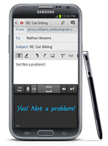
The Galaxy Note II lets you personalize your mobile world with the S Pen. You can write handwritten messages in emails or decorate special occasions on your calendars. Handwritten items are only viewable on your mobile calendar and are not synced with Outlook® or online calendars.

S Note on Lock Screen: 
Hold the S Pen button while double-tapping the screen to activate S Note™. This gesture can also be used on the Lock Screen to activate S Note. You can also use your S Pen to draw a line down to the Home key to unlock your screen instead of swiping your screen with your finger.

Contextual Home Screens: 
Much like the S Pen contextual home screen, there are additional contextual home screens displayed when you plug in the earphones and when you dock the phone.

Accessories


Smart Dock:
The optional Smart Dock accessory offers multiple connection points, with three USB ports, an audio-out port, and an HDMI port. Plus, the Galaxy Note II fits perfectly in the dock even when encased in a Samsung Flip Cover.
Gallery


Gallery Views: 

The Gallery offers a variety of ways to view your photos. You can choose between a Grid view (organized folders), Timeline view (a 3-D flipbook in chronological order), or a Spiral view (a spinning 3D spiral of photos) by touching the view icons in the top right corner of the Gallery.

One-Touch Cropping: 
S Pen makes it easy to crop a photo, or even just a small element of a photo, right in the Gallery. While viewing the photo you want to crop, click and hold the S Pen button, and draw around the desired cropping area. Your original photo will remain intact, but the cropped portion will be copied to your clipboard. You’ll also be given the option to send the cropped image to a variety of other applications, including email, S Note and Paper Artist.

Personalization

One-Handed Use:
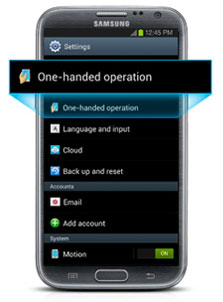
You can enable one-handed use for the Samsung keyboard, calculator, phone dialer and unlock pattern. When you turn on the one-handed option, the enabled apps shrink and move toward one side of the screen so you can easily touch the keys with your thumb. Touch Settings and under Personal, choose One-handed operation. Place a checkmark in the box next to the desired options.


Smart Gestures

Enabling Smart Stay:
You can get key info—such as number of missed phone calls and messages, number of emails received, remaining battery percentage, and more—simply by waving your hand over the top of a sleeping device. To enable or disable this feature, go to Settings > Motion and check or uncheck the box next to Quick Glance.

Smart Gestures:
Smart Stay keeps the screen on as long as you’re looking at it. To enable the Smart Stay feature, touch Settings > Display. Place a checkmark in the box next to Smart Stay.

Notifications Panel:
Double-tap the top of the phone to instantly open the Notifications Panel.

Direct Call: 
When a contact’s phone number is shown on-screen, Direct Call lets you lift the phone to your ear to automatically dial. When reading a text message, you can call back the sender by simply lifting the phone to your ear.

Social Sharing

S Beam:
Use S Beam™ to share links to maps, web pages, apps and YouTube™ videos with any Android™ device that is NFC enabled. You can also exchange contacts and calendar events. S Beam allows for the transfer of files up to 1GB in size with any S Beam–capable device. To get started, touch Settings > Share and transfer > More settings. Move sliders next to NFC and S Beam from off to on (gray to green) to enable the feature.

Sharing an S Note with S Beam: 
In addition to photos, videos and documents, you can share an S Note via S Beam with other S Beam and S Note capable devices.

Sharing an S Note with Social Networks: 
Collaborate with ease by posting native S Note files, with layers, to your social networks like Facebook® and Google+™ for other Galaxy Note II users to download and edit.

S Pen

Contextual Home Screen:
Contextual awareness means quick access: When the S Pen is removed from its integrated slot, a menu of S Pen–related apps will automatically pop up for selection. The Contextual S Pen home screen and menu are customizable, so you can select which S Pen applications you want handy. Available apps range from productivity to graphic and include the preloaded S Note. Various third-party apps that use S Pen are also available.

S Pen Shortcuts: 
Use the S Pen to scroll down the Notifications Panel to select a number of S Pen shortcuts—Quick Command, S Note and more.

Voice Commands


S Voice: 
Whether you want trivia answers or directions to the closest dry cleaner, S Voice™ is your personal assistant, responding to every voice command with accurate, helpful information pulled from the respected Wolfram Alpha® database. S Voice handles your on-phone tasks too, like dialing calls, sending messages, launching the camera, and even opening and controlling applications. For example, you can use S Voice to open the Facebook® app and update your status.


Source

Read more ►

Music Hub: All The Music You Want, All In One Place

0 comments

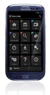
Samsung Music Hub™ makes enjoying music easier than ever. Upload your music collection to the cloud, stream and purchase songs from an extensive catalog, and listen to personal radio—all in one app. Use these tips and tricks to learn more about how to use Music Hub’s features.


With Music Hub, you can access millions of songs from our catalog whenever and wherever you are. Simply tap Catalog and either browse by music genre or search using the magnifying glass icon. When you find a song or album you like, either tap the title to play or tap the icon to the right to add to My Music or to a specific playlist.

Listen Offline

Music Hub allows you to store your favorite music on your device for offline listening. There is nothing worse than remembering to store music offline minutes before the flight, and spend the entire flight listening to only two or three songs. Music Hub offers the simplest way to make music available offline in just two easy steps:

Step 1: Go to My Music and select the icon to the right of the song or playlist you like.

Step 2: Tap “Download Now.” This will default to Wi-Fi® only, but you can simply adjust the settings to enable this feature over your cellular network. Once you listen to a song, it is temporarily stored on your device and displayed in a bold font to indicate offline availability.


Share a Playlist


Music Hub allows you to beam songs and playlists with another Music Hub subscriber on a Samsung Galaxy NFC-enabled device. Follow these steps to share your playlist:
Step 1: Access the playlist you’d like to share from My Music.

Step 2: Open the playlist to view the tracks.

Step 3: Hold your phone against another Music Hub subscriber’s Galaxy device (remember to turn on NFC). The playlist image will shrink.

Step 4: Tap the center of the image to beam. The playlist will instantly appear in the other subscriber’s My Music.

Upload Your Music to the Cloud Locker & PC Listening


We understand that over the years you’ve accumulated a lot of digital music that you most likely manage in iTunes® and Windows® Media Player. With the Music Hub Uploader, it is easy to move your entire music library to the cloud. Music Hub subscribers are given 100 GB of cloud storage, and employs Scan & Match functionality to transfer your music, cutting down on upload time and offering you higher quality files where available.

Follow these steps to upload your music from your PC to the cloud:

Step 1: From your PC, go to Music Hub.

Step 2: Run the Uploader, and select your music folder—iTunes or Windows Media Player. A notification will appear when the upload process is complete. The next time you visit Music Hub on your mobile device, your music will instantly be available in My Music.

You can also listen to your music and music from our catalog on your PC from musichub.com. Simply sign in with your Samsung Account, and enjoy hours of music listening.


Enjoy Personal Radio


Sometimes it’s nice to sit back and enjoy music programmed for you. With personal radio, you can enjoy personalized radio stations based on your favorite artists or songs. Follow these two easy steps and start enjoying personal radio:

Step 1: From the home screen, select the radio icon and then select Personal.

Step 2: Type an artist or song, select from one of the generated stations, and enjoy ad-free listening. Feel free to skip ahead as often as you like.

At any point, tap the circled “i” icon and view all the songs you’ve just enjoyed. You can add any of them to your own collection by clicking the “tag” icon. These songs can be found in the Tagged section later and mixed into any of your playlists.


Get Intelligent Recommendations

One of the best elements of Music Hub is that it actually gets smarter the more you listen. There are two ways to take advantage of this great feature:

1. Simply double tap the album art on the player page to see options. Select the Lightbulb icon to find similar music to what you are listening to. A list of recommended songs, albums, artists and radio stations will be generated for you.

2. From the home screen, tap the Lightbulb icon for Recommended songs. A list of songs will be generated based on the songs you’ve been listening to.

Content such as DRM content or encrypted files may not transfer to your Samsung device.

Samsung, Galaxy S and Media Hub are trademarks of Samsung Electronics Co., Ltd. Other company names, product names and marks mentioned herein are the property of their respective owners and may be trademarks or registered trademarks. Screen images simulated. Appearance of device may vary.

The above content is provided for information purposes only. All information included herein is subject to change without notice. Samsung is not responsible for any direct or indirect damages, arising from or related to use or reliance of the above content.


Source
Read more ►

Wednesday, November 14, 2012

Android 4.2 "Daydream" mode

0 comments

One of the new features of Android 4.2 that hasn't gotten much mention recently is the new "Daydream" mode. It hasn't gotten much play because unlike the other major updates like the gesture keyboard, Daydream mode is a flashy extra, but it is quite a nice one. If you've gotten the Android 4.2 update, you'll find Daydream kind of hidden in Settings>Display>Daydream.

It is essentially a screensaver, although it will only turn on under certain conditions. You can set your Android device to start Daydreaming either when the device is docked, when it is charging, or both. As the Daydream mode, users can choose between having the device display the clock, shifting colors, Google Currents headlines, or photos.

The clock and colors are fairly basic (although the clock has a nice feature to set the display to a "very dim mode", which is great for a bedside table), but this may be the first interesting use of Google Currents that we've seen. Currents has always been somewhat overshadowed by other apps that do the same sort of thing like Flipboard, Pulse News, or Feedly. Unfortunately, we say it is an interesting use of Currents because it isn't exactly useful. While it is nice to see the headline scroll of Currents in Daydream, it isn't interactive at all, so you can't tap an interesting headline to jump into the story. So, the whole thing ends up feeling a bit pointless.

Photos can be displayed in two different modes, either a slideshow, or as a "photo table" (basically a collage). For either option, users can choose to show photos that are on the device, or select any or all of your Google+/Picasa photo albums to cycle through. That is a great option for anyone who uses Google+/Picasa, or keeps all of their photos on their Android device at all times. But, if you use Flickr, Facebook, or Instagram, and don't keep copies on your device, this feature won't really do much for you.

Overall, Daydream mode is a nice new feature, and we can see some pretty interesting potential there for offering more options, but it definitely feels like a first attempt, and there is a reason why the feature is a bit buried. We'd love to see more services be able to hook into it, and we'd love to see the displays be more interactive, especially with headlines.


Source
Read more ►

Sony Xperia J Review

1 comments

Introduction:

Sony has a good track record for delivering decent mid-range Android smartphones at very competitive price points, and the Xperia J is the latest handset to join the party. Its 4-inch display and beefy battery are among the features that make it stand out, at least when comparing specs sheets with alternative offerings. A 1GHz processor, a 5-megapixel camera, and a VGA front-facing snapper are also in stock, meaning that the Sony Xperia J could be a bargain hunter's dream handset. But how does the smartphone perform in reality? Well, there's only one way to find out so let's fire it up and put the J through its paces.


Design:


As one would expect from a smartphone situated in the lower mid-range category, plastic is the predominant material that the Sony Xperia J is made of. The device's front side looks quite plain and boring, but its curved back side is a lot funkier and easily makes the handset stand out. With its matte finish, the smartphone's battery cover is extremely resistant to fingerprints, all the while providing enough grip, thus allowing us to comfortably hold and operate the device with a single hand.
With the Sony Xperia J you get a pair of notification lights. One of them is located right next to the earpiece and indicates when the smartphone is charging, but the one you'll probably find a lot more useful is at the bottom. It is of the RGB kind, so depending on what kind of notification you have pending – be it a new text, a new Facebook message, or a “Low battery” warning, the light glows in a different color. The light is hidden under the phone's plastic panel, so you won't see it unless it is on.

Display:


The 4-inch LCD display on the Sony Xperia J is actually quite good. At 480 by 854 pixels, it may not be worthy of having an “HD” tag attached to it, yet with its 245 pixels per inch, the amount of detail it treats our eyes to is sufficient for the device's class. Moreover, the panel has a pretty neutral color representation, so colors look neither too dull, nor too saturated. We were also pleased to see that the display exhibits very wide viewing angles, and it shines bright enough to be usable in broad daylight. It is a bit annoying, however, that due to the lack of an ambient light sensor, you'll have to adjust the screen's brightness yourself, either by going to the Settings menu or with the help of a widget.

Source
Read more ►

Sony Xperia T review

0 comments

Back when the driving seat was shared with Ericsson, Sony was a little short of delivering a real winner in the high-end market, the company's top-range smartphones always a notch below the Galaxy S lineup and their HTC counterparts. Now on their own, Sony cannot shy away from the toughest of battles and the Sony Xperia T is ready to be thrown in the fire.


A true flagship, the Sony Xperia T comes properly powered by a Snapdragon S4 chipset, boasting a class-leading 13MP camera and a marvelously sounding 720p display. There's no quad-core on its resume, but the Xperia T is ready to take on the best Android offerings out there.
Key features
Quad-band GSM /GPRS/EDGE support
3G with 42.2 Mbps HSDPA and 5.76 Mbps HSUPA
4.55" 16M-color capacitive LED-backlit LCD touchscreen of 720p resolution (720 x 1280 pixels) with Sony Mobile BRAVIA engine; Scratch-resistant glass
Android OS v4.0.4 Ice Cream Sandwich
Dual-core 1.5 GHz Krait CPU, 1 GB RAM, Adreno 225 GPU, Qualcomm Snapdragon MSM8260A chipset
13 MP autofocus camera with LED flash and geotagging, Multi Angle shot
1080p video recording @ 30fps with continuous autofocus and stereo sound
1.3 MP front-facing camera, 720p video recording
Wi-Fi b/g/n and DLNA
GPS with A-GPS, GLONASS
16GB of built-in storage, microSD card slot
microUSB port with MHL and USB-host support
Stereo Bluetooth v3.1
Standard 3.5 mm audio jack
Stereo FM radio with RDS
Voice dialing
Deep Facebook integration
PlayStation Certified, access to the PS Store
Accelerometer and proximity sensor
NFC connectivity
Main disadvantages
Display has sub-par viewing angles for a flagship
Slightly thicker than main rivals
Relatively modest battery
JellyBean update not available at launch
Poor loudspeaker performance
Video recording could be better
The Sony Xperia T hasn't got the raw muscle of some of its rivals, but there's enough to get you interested. And once you go and give it a try, the design and handling will hardly let you down. In a smartphone market as crowded as today's, handsets with this much character are hard to come by. Now, a grateful nod is well in order to old allies and the Xperia Arc.
Setting record benchmark scores is one thing, but having an excellent chipset in a body that's great to look at is to many a more than even tradeoff. The Sony Xperia T should not be afraid of facing its rivals in a raw processing power battle, though it's the beauty contests it enjoys the most.


And then there's the software enhancements, to which Sony paid more than enough attention. The Android ICS on the Xperia T comes with a great-looking UI, which Sony claims is also one of the most functional around.


Read more ►

ZTE Flash Full Specifications-US Mobile phone with Android ICS and Camera 12.6 MP

2 comments

One phone provider in the United States, Sprint, has just launched a new Android phone. Android mobile phone is midend from ZTE, namely ZTE Flash.

Mobile is relying on the operating system Android 4.0 Ice Cream Sandwich as the OS on it. In addition, another advantage of this phone is a 12.6 MP primary camera is embedded in the rear. The camera is equipped with LED flash and HD video recording capabilities. To complement, there is a 1MP camera on the front.


This mobile phone comes with a screen measuring 4.5-inch IPS HD resolution. On the inside, ZTE Flash comes with a dual core 1.5GHz Qualcomm MSM8960. The performance of these processors will be supported with a 1GB RAM. For the problem of storage, the phone is 8GB of internal memory and a MicroSD slot up to 32GB supported.

In the battery, the phone offers a battery Li-Ion 1780 mAh capacity which promises durability 8 hours talk time. Other features available on this phone include Bluetooth 4.0 and support for NFC technology. Regarding the price, this phone Sprint sells for $ 130 USD.

You can look ZTE flash full specificatios here :


Overview 2G Network CDMA 800 / 1900
3G Network CDMA2000 1xEV-DO
4G Network LTE 1900
SIM Mini-SIM
Announced 2012, November
Status Available. Released 2012, November
Design Dimensions 133.9 x 65.7 x 9.7 mm (5.27 x 2.59 x 0.38 in)
Weight 142 g (5.01 oz)
  - Touch-sensitive controls
Display Type IPS LCD capacitive touchscreen, 16M colors
Size 720 x 1280 pixels, 4.5 inches (~326 ppi pixel density)
Multitouch Yes
Protection Corning Gorilla Glass
Ringtones Alert types Vibration, MP3, WAV ringtones
Loudspeaker Yes
3.5mm jack Yes
Storage Card slot microSD, up to 64 GB
Internal 8 GB storage, 1 GB RAM
Connectivity GPRS No
EDGE No
Speed Rev. A, up to 3.1 Mbps; LTE, Cat3, 50 Mbps UL, 100 Mbps DL
WLAN Wi-Fi 802.11 a/b/g/n, Wi-Fi Direct, DLNA, Wi-Fi hotspot
Bluetooth Yes, v4.0 with A2DP
NFC Yes
USB Yes, microUSB v2.0
Camera Primary 12.6 MP, autofocus, LED flash
Features Geo-tagging, face detection
Video Yes, 1080p@30fps
Secondary Yes, 1 MP
Platform OS Android OS, v4.0.4 (Ice Cream Sandwich)
Chipset Qualcomm MSM8960 Snapdragon
CPU Dual-core 1.5 GHz Krait
GPU Adreno 225
Features Sensors Accelerometer, gyro, proximity, compass
Messaging SMS (threaded view), MMS, Email, Push Email
Browser HTML5
Radio TBD
GPS Yes, with A-GPS support
Java Yes, via Java MIDP emulator
Colors Black
- SNS integration
- Active noise cancellation with dedicated mic
- MP4/DivX/Xvid/H.263/H.264/WMV player
- MP3/eAAC+/WMA/WAV player
- Organizer
- Document viewer
- Voice memo/dial/commands
- Predictive text input
Battery Standard battery, Li-Ion 1780 mAh
Stand-by Up to 216 h
Talk time Up to 8 h


Source : GSMarena.com
Read more ►
 

Copyright © New Mobile Phone Zone Design by O Pregador | Blogger Theme by Blogger Template de luxo | Powered by Blogger